Trellis AI (Consumer, 0 to 1 MVP)
AI reader app for educators and students gets a redesign for engagement and delight
Trellis is an AI reader app that helps users read, listen to, and interact with books through its AI assistant, Celeste.
Role
UX designer
Time
Oct 2023 - Dec 2023
Team
2 designers
1 founder
2 engineers
My contribution
UX and UI, collaborating with cross-functional teams, developing design roadmap, auditing
The task at hand was very clear
Founder wanted 2 critical user flows to be redesigned. Optimize engagement and create delight was the mantra.
Anchor the team. Show agency.
With a short contract and a remote startup team, deliverables can get derailed quickly. To bring structure, we maintained an evolving design roadmap in a shared sheet and used it to review priorities, align decisions, and track tasks with accountability.
I attended daily standups, alternate-day design sessions, founder feedback reviews, and weekly team share-outs with engineers.
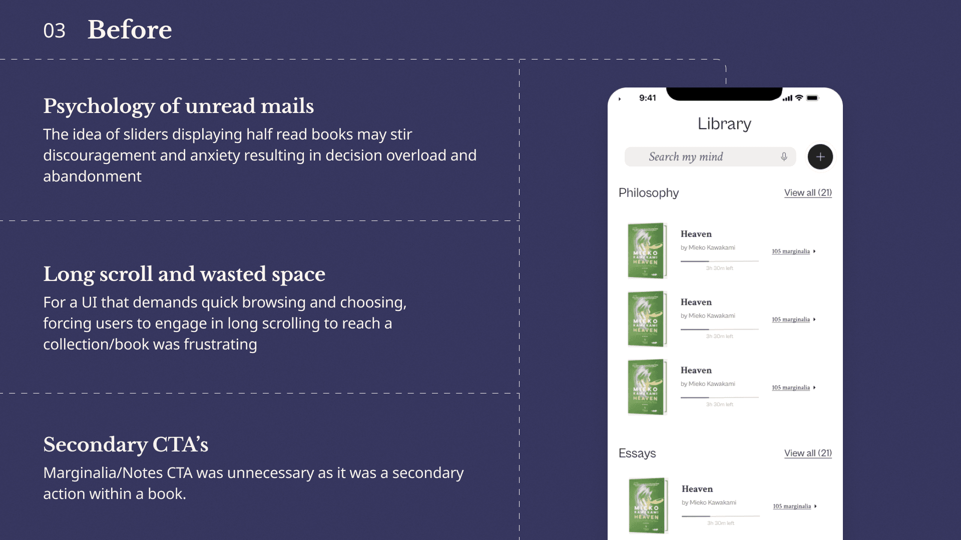
Audit
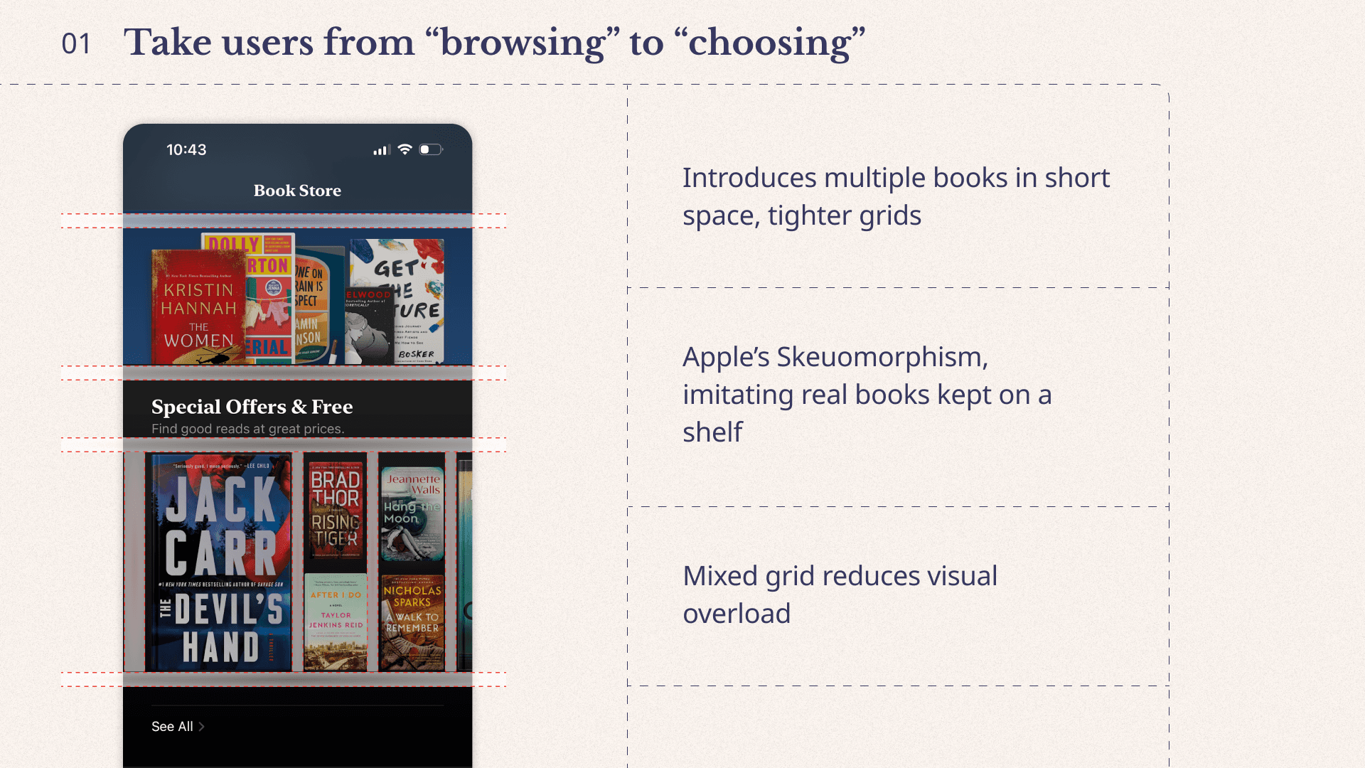
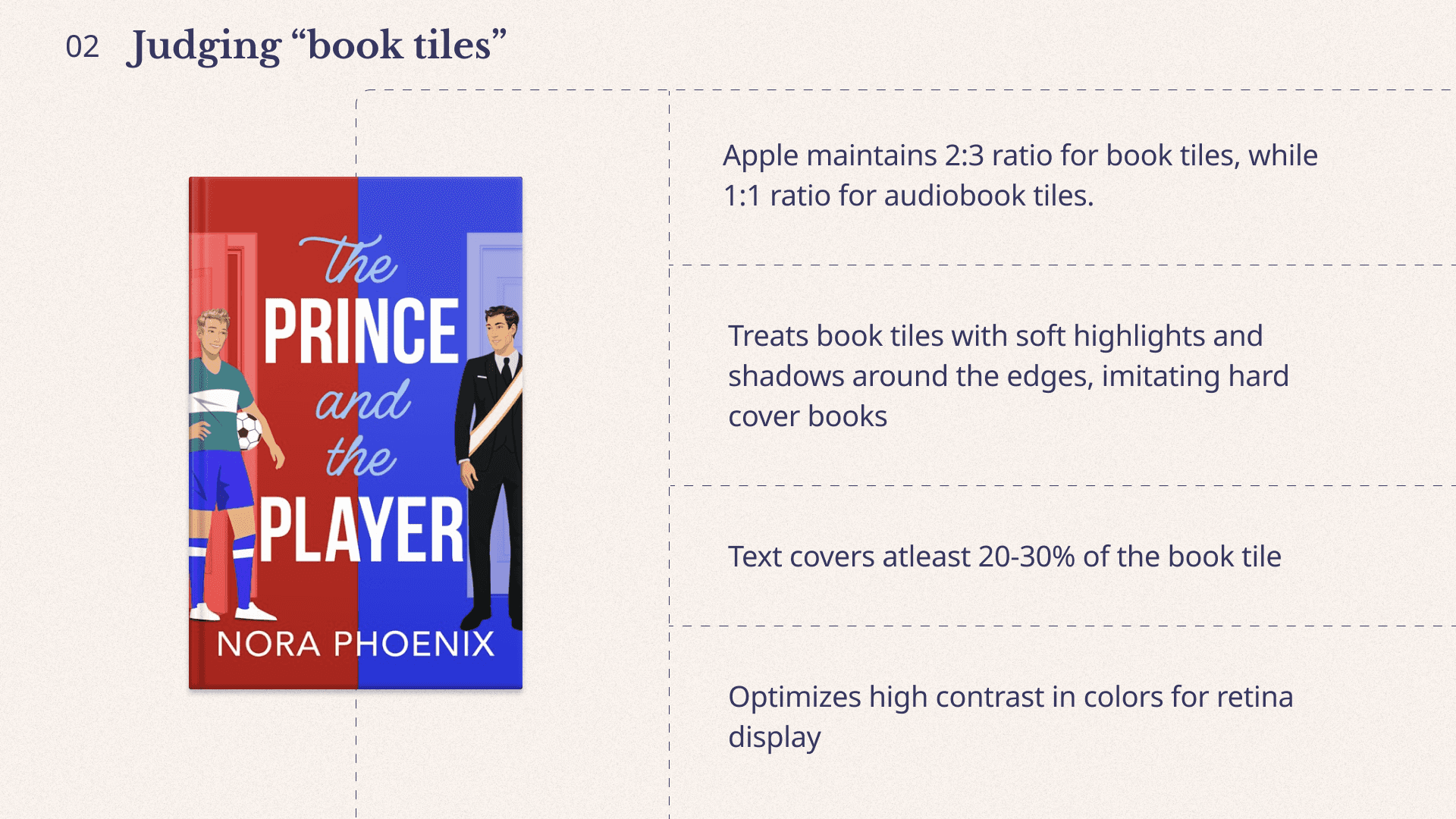
Apple Books (Grid-heavy interface)
We studied reader apps like Apple Books and Libby to design a grid-heavy interface without overwhelming users. The competitive audit gave us reusable patterns for hierarchy, spacing, and navigation in content-dense reading interfaces while preserving a clear visual path.
Solution space
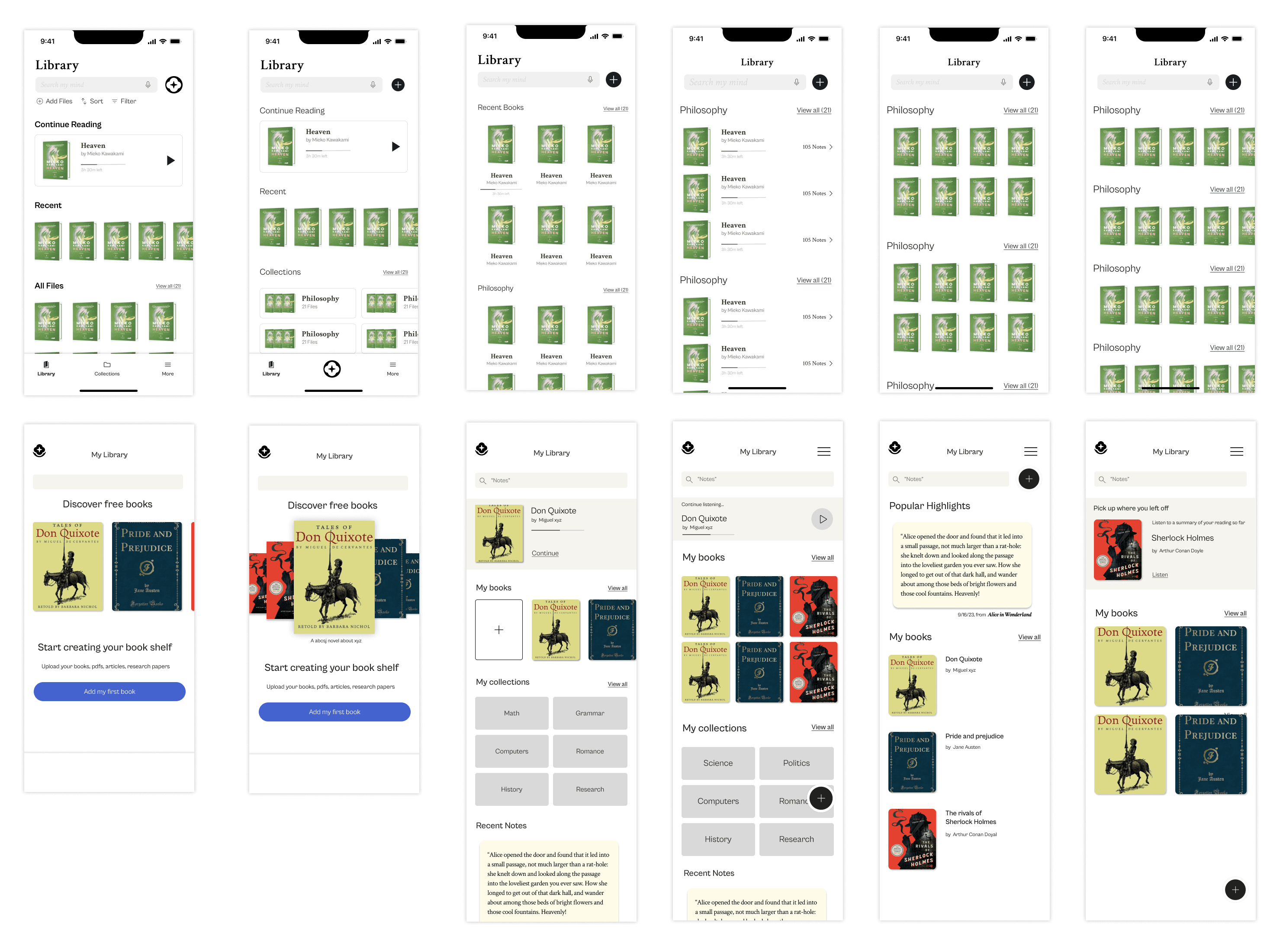
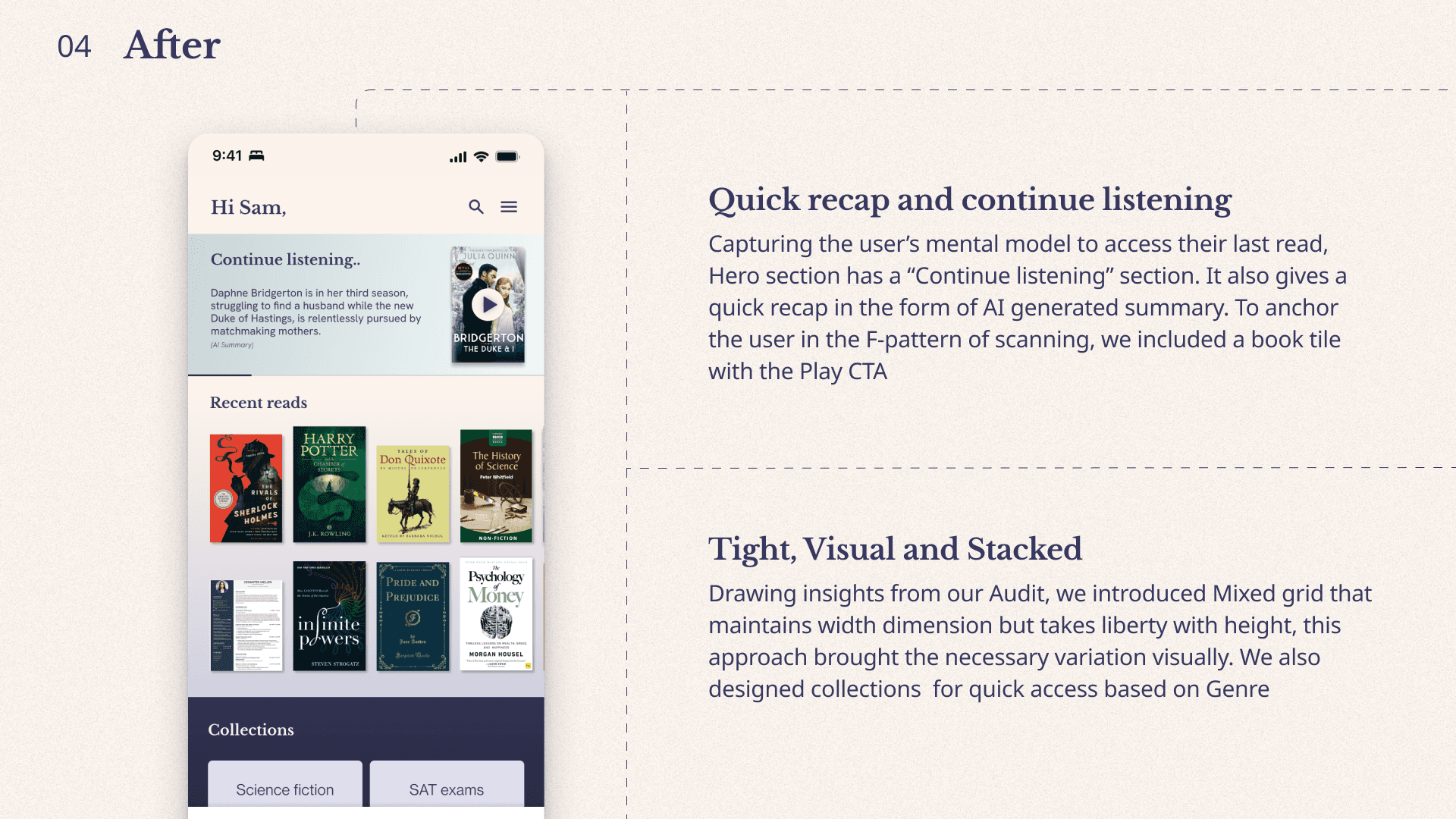
Optimize engagement- Library
This was the first and most central experience in the user journey. We tested tile treatments and mixed panel arrangements to keep the library expressive while improving scanability and interaction flow. We explored multiple visual permutations for book stacks: vertical, horizontal, grouped, and listed. This helped us create a readable layout while reducing cognitive overload.
Design decisions
Solution space
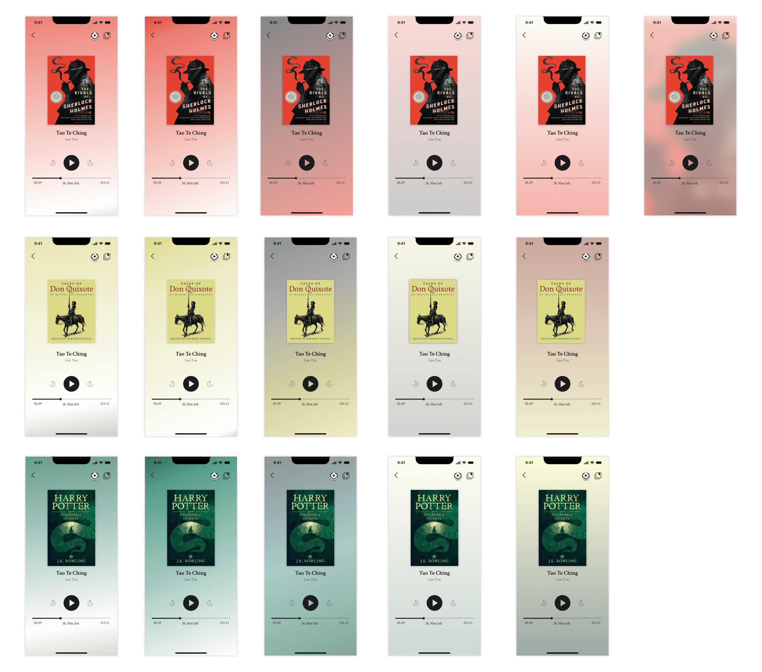
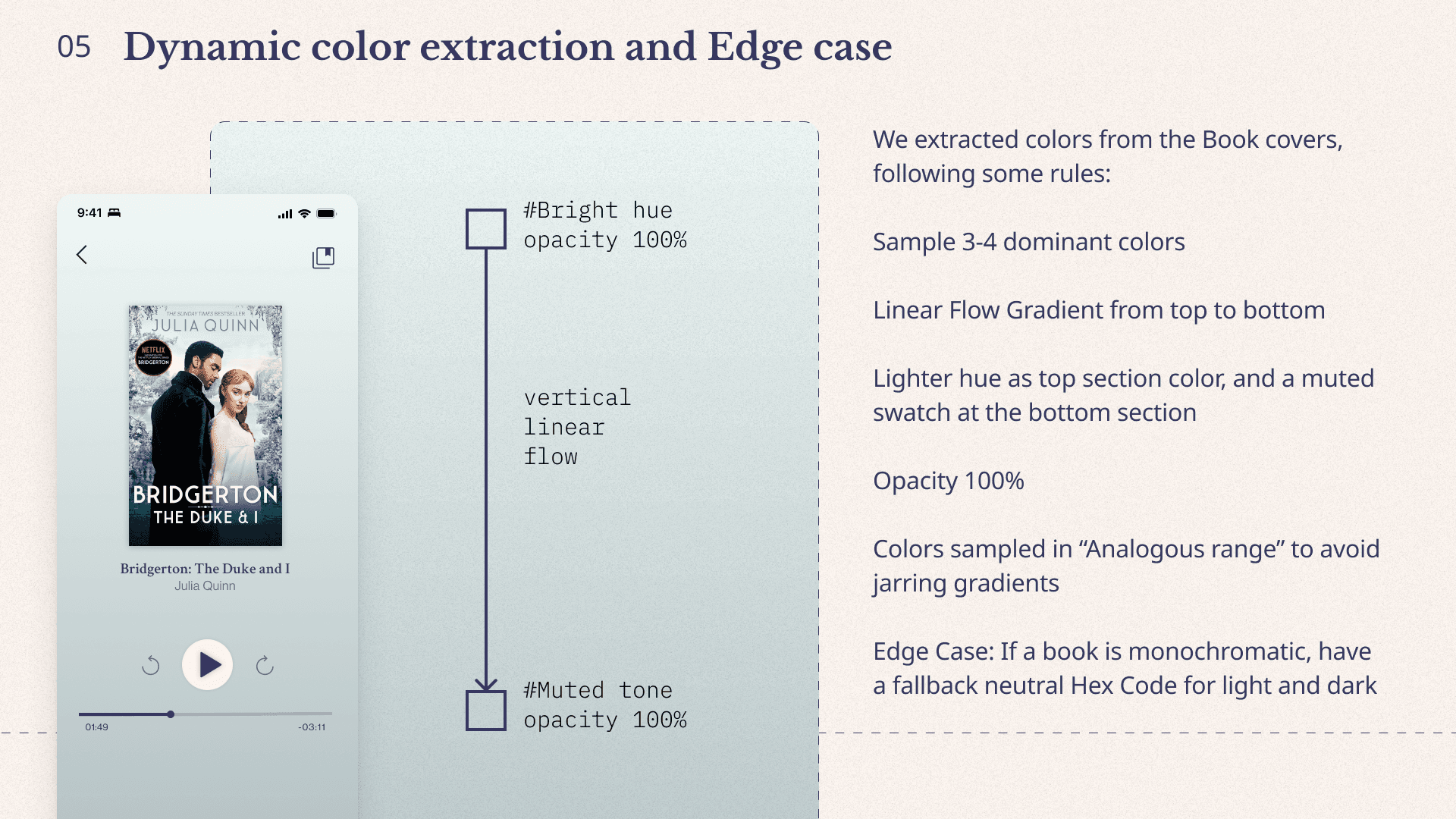
Create delight- Audiobook
"Art on museum walls" was the founder's vision. We aimed to welcome readers into the author's world by elevating each book visually in a poetic way. Our exploration sampled various gradient systems, including monotone and duotone. After testing across books with dark and bright covers, we finalized a duotone treatment for dynamic contrast.
Design decisions
Final outcome
As we headed toward the end of the contract, we were happy to deliver scope within the timeframe. These deliverables were piloted by engineers in TestFlight first.
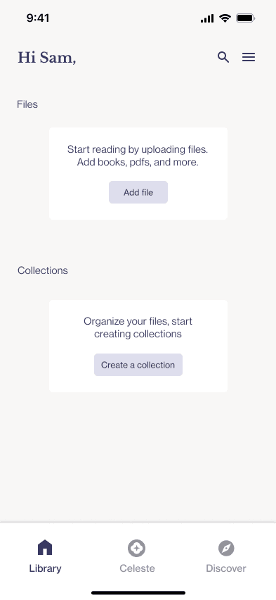
Empty state
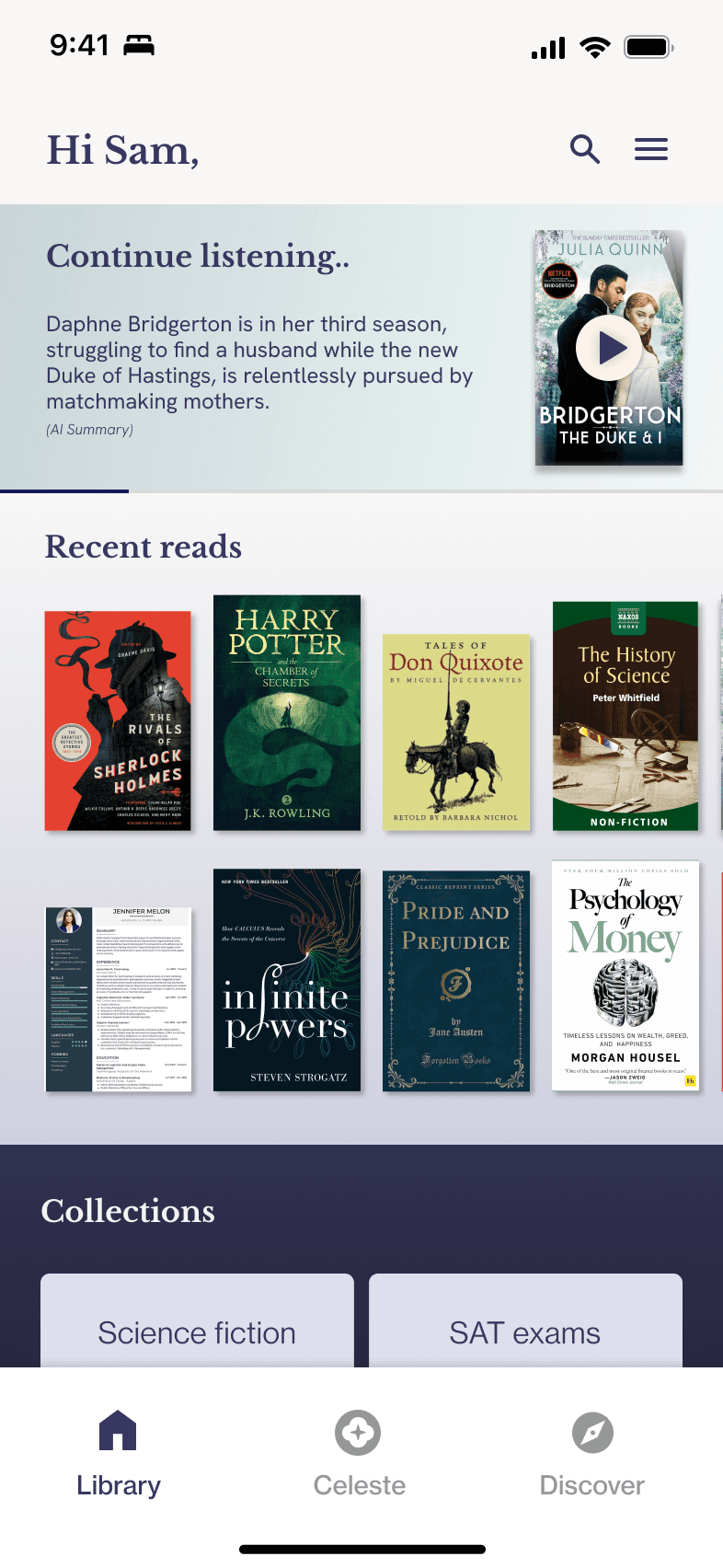
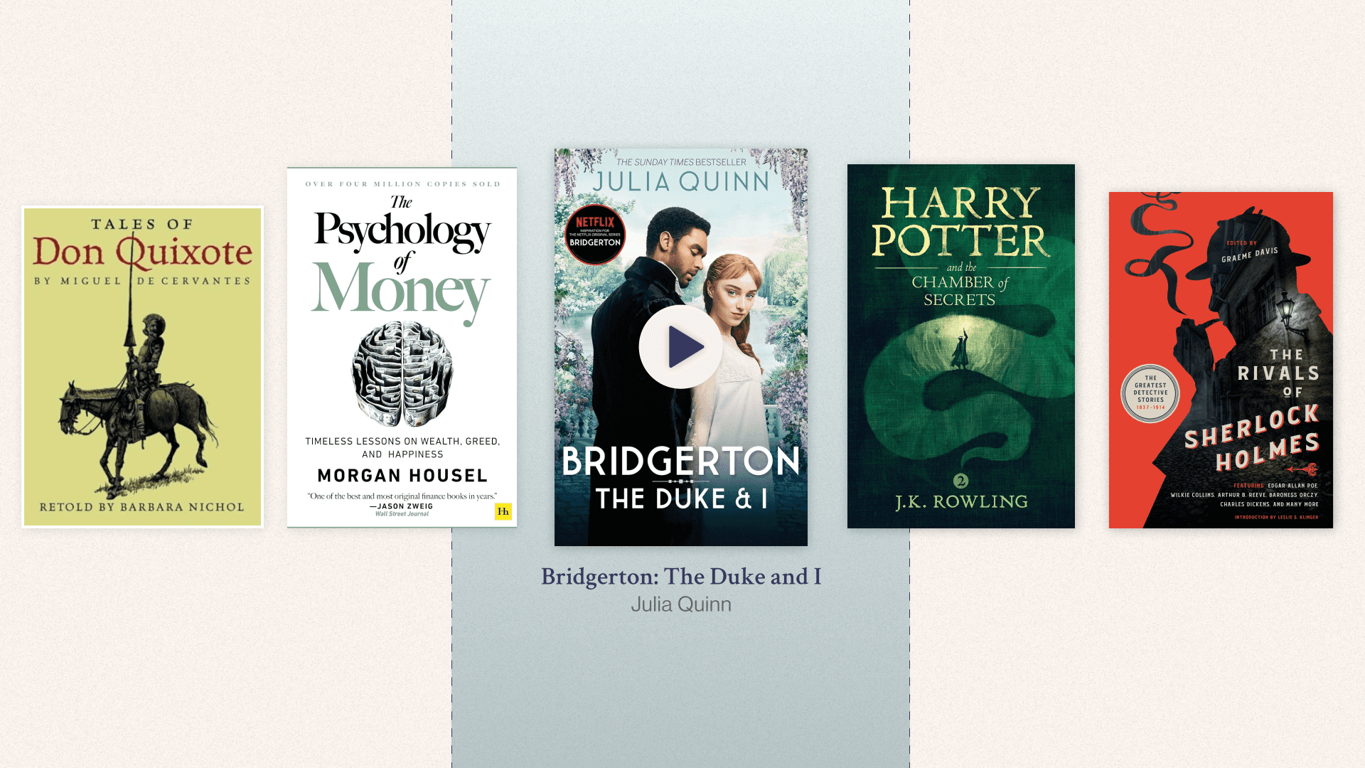
Library
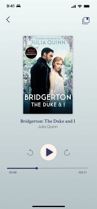
Audio playback
Things that went right
1. Product roadmap was golden and anchored the team.
2. Early collaboration with engineers saved time and effort.
For future
1. Further refine typography and iconography.
2. Validate designs with user interviews to gather qualitative and quantitative insights.